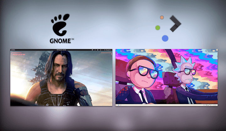
GNOME vs KDE Plasma

Both default setups of KDE and GNOME are simply legible. Plasma looks like what you’d expect if you’re coming from Windows, with its bottom panel, menu, and task manager, and the defaults are clean and simple, rather welcoming for a new user.
GNOME, on the other hand, is the precise opposite approach: the default metaphor is the opposite of what you’re used to, with no active task management, no desktop icons, no application menu, no dock or taskbar. Activities are a good concept, easy to learn, but it goes against most other desktops I’ve used, so I took a while to get used to switching windows through the activities or the keyboard.
Configuration
Plasma has an overabundance of options, plasmoids, layouts and panels, and as many configuration options as you want. You can tweak colours, themes, window borders and controls, and even the position of panels and toolbars on most applications, to get to the desktop and layout you want to use. You can’t fault KDE on customization and it is the most configurable desktop environment I’ve ever used on any OS.
GNOME, by default, has almost zero configuration. However, you can tweak quite a few things through extensions and GNOME Tweaks, but these come with a convoluted installation process: look for GNOME Tweaks, install it, then install extensions, and the browser add-on, and the host connector, then manage extensions through GNOME Tweaks, where you find their own set of preferences. I appreciate the logic of offering a very clean and simple default desktop, but enabling extensions in one-click, with all the browser extensions and host connector configured, or providing an “extension store” directly from GNOME Software would be far easier, and would not clutter the interface whatsoever.
Look and Feel
The default look of KDE is pleasing, with bright icons, nice gradients and shadows, and smooth animations switching from a menu to another, dragging windows around, and generally while using the system. The default theme, Breeze, looks good on plasmoids and application widgets, and it offers a dark mode by default if you prefer that. Plasma looks modern and polished, and it feels natural to use, with each element fading in and out.
GNOME, on the other hand, comes with Adwaita. It is a big theme: there is a lot of padding around buttons, menus, and everything looks quite big. Icons are a bit dated in my opinion, with muted colours. Adwaita is usually plain and minimalistic to me, although it is very functional and legible, with nothing catching your eye specifically, letting you focus on your work.
Applications
As per applications, it’s a tough one: GNOME seems to have a lot more applications available by default, compared to KDE, but GNOME applications are severely lacking in features.
KDE Plasma has very stable applications, but little choice: since most applications do everything and are extremely configurable, there is little incentive to work on a new project instead of contributing to an existing one. Default applications can sometimes look dated, without place buttons or widgets and convoluted interfaces. They are powerful, though, and do not lack important features. Once you get familiar with a KDE application, you can pretty much do anything you like.
GNOME, on the other hand, has a nice choice of different applications, but they have issues. Photos are too simple, Music crashed a lot, and Contacts didn’t support contact groups. One problem is desktop consistency: since GNOME does away with menu bars, once you install something that does not strictly adhere to GNOME guidelines, it quickly looks out of place and behaves differently.
Performance
In terms of performance, KDE Plasma has quick and smooth animations for panels and menus and uses fewer RAM compared to GNOME. Applications open promptly, and stay snappy, even under load. GNOME also behaves nicely by default, but it usually uses more RAM and CPU. If you have a lower spec system, GNOME might not be the right choice for you.
In the end, I genuinely liked both. In terms of Look and feel, KDE matches my tastes more closely since I came from a Windows Ecosystem, but GNOME’s interface and interface guidelines appeal to the minimalist in me. In fact, I daily drive the GNOME from Pop!_OS and the minimalism helps me focus on whatever I’m up to. You can find out why I love Pop!_OS here